Important…
Only read this if:
- You’ve paid good money to get your website online, and you’re not getting the results you expected…
- Or you’re frustrated because you know you have a great product or service and it’s not selling like crazy…
- You know there’s huge potential to sell to a world-wide audience but you’re not reaching them…
According to Albert Einstein, the definition of insanity is…
“Doing the same thing over and over again and expecting different results.”
And yet people still fall into this trap and if you know you should be making twice or even three times what you’re making right now.
You’re one of them.
Here’s what I mean…
I’m willing to bet you’ve got people visiting your website that either don’t buy or never come back.
There’re one of three reasons for this.
- You have a website that looks like an advert
- You don’t fascinate your visitor and compel them to read
- You don’t get their email address
These are the three must haves for making it online.
1. You have a website that looks like an advert

This may come as a bit of a shock to you, but when people go to the internet they are not looking for adverts.
People hate advertising.
It’s the one thing they see all over the place.
They switch channels to avoid the mindless jingles… the pathetic attempts to entertain, and the in-your-face selling.
And now they land on your web site and it looks like just another advert or business brochure.
You’ve got lots of colourful graphics, photos and images.
Bored, or scared they’ll be sold something, they click away never to return.
Do you like being sold to?
Or do you prefer to buy?
There is a difference, and that difference is what will make or break your website.
By the way, let’s not get all bent out of shape about the word selling.
It literally means ‘to serve.’
And that’s why you’re in business isn’t it?
To help people solve their problems.
Essentially people go looking online for two reasons.
They say to themselves…
“I want this and I don’t have this.”
Or “I have this and don’t want this.”
Let me tell you what this means.
When someone has a desire, they want something they don’t have.
If you’re selling a better way of life, then start with that on your website.
When someone has a problem they want to get rid of and it’s urgent, you start with that.
Does your website reflect either of these two approaches?
2. You don’t fascinate your visitor and compel them to read

When your visitor lands on your website, you’ve got about three seconds to keep them there.
A little while ago on the internet the Gurus were talking about getting attention and that attention was like a currency.
Well, that’s changed.
It’s no longer good enough just to get attention.
I mean if you shout at someone you can get their attention, but you probably won’t keep it for long.
It’s interesting how quickly things change online.
Today you must fascinate your readers otherwise you’ll lose them.
And there’s a number of ways you can do this.
Here’s some you can use.
You can create a kind of mystique.
You see this all the time with magicians.
They captivate their audiences in seconds with this strategy.
If you have a secret or a special unique way of getting results or eliminating problems, you can use this approach.
You can use prestige.
Rolls Royce, Bentley and Mercedes do this all the time. If you are selling a ‘high ticket’ item or service, prestige is the way to go.
How about using power? Now this is persuasive if you’re a Tony Robbins or other celebrity Guru figure.
If you’re not, then you can demonstrate power by the results you’ve helped others get.
Yes, testimonials and case studies show how powerful you or your product is.
These are just three of the seven main ways to fascinate people.
However, they are useless if your visitors can’t read your words.
So many websites have all sorts of colourful backgrounds.
Like black, green, blue, etc.
But tell me how many books you’ve read with a coloured page as a background?
And what about white text on a black background?
Newspapers use a white background and black text because they know it’s best for engaging readers.
And there are no fancy type fonts either!
And while we’re on this subject, line length must be around 60 characters including spaces.
And you’ll want lots of white space to make it look inviting to read.
Paragraphs must have two to three sentences at most.
And no more than 12 words per sentence.
Okay let’s move on.
3. You don’t get their email address
“Making money takes thinking, planning, and executing.
Of all the mistakes you can make online, this is by far the worst.”
Why?
Because most people won’t buy anything from you the first time they visit you.
That means you’ll want to create a relationship with them so that over a period of time they get to know, like and trust you.
And the best way to do this is with email.
But if you didn’t get their email address then you’re dead in the water.
You see over 90% of all sales made from websites are as a result of email communications.
What this means to you is you must give your visitors a compelling reason to give you their email address.
And it’s not the old and tired ‘get the first three chapters of my book free.’
You want to give them information that’s relevant to what they searched for in the first place.
Good information can help visitors become interested in your product.
A free guide is better than free chapters.
I’ll come back to this subject in just a moment but first I think it’s only fair to warn you.
If it were that easy, then everyone and his dog would be making bucket loads.
But they’re not.
Because they don’t know the things you now know and are about to discover.
To make your website work miracles in your life, you’ve got to see it as you would a salesman.
Everyone in business would love to hire a salesman who could go out there and sell their stuff like there’s no tomorrow.
But guess what?
They can’t find anyone who is willing to do this.
And if they could, they couldn’t afford to pay them.
So, what to do?
You create yourself a ‘cyber salesman.’
That is a website that does all the selling for you.
Right now, if you took all the words and images off of your website and gave them to a salesman, could he sell for you?
If not then pay close attention because you’re about to discover some of the most important strategies you can use online so you never have to sell in person or over the phone again.
Your new cyber salesman does it all for you.
But you’ve got to give him what he needs or else he’ll fail miserably.
Here’s a partial list of the way your website must look and the type of wording it must have in order to make sales.
Remember this…
Selling is serving.
If you love to help people then this is the best way to do it, online without you having to be there in person.
Now, who wouldn’t want that?
The questions you’re about to see are taken from a 100-part questionnaire created to optimise the selling quotient (SQ) of a website.
The closer you get to 100, the more sales you’ll make.
I’ll tell you more about this later and how you can get an accurate score for your website for free so you can make all the changes needed to make you a fortune online.
Let’s look at how to turn your website into a tireless salesman who works to make you money day and night.
We do this with well-thought-out and laid out…
Landing pages.
Landing pages may seem simple but they’re actually the entrance door to your business.
If they look uninviting people won’t enter.
When your visitors arrive at your front door, is it inviting?
When they do enter they will begin a conversation with you
Your conversation must be focused almost entirely on them.
It’s the same when you meet someone for the first time.
With so much competition out there, you cannot afford to screw up this first contact.
If you don’t get a favourable response from the start, you never will.
Your landing page is the place where you’ve sent them from your advertising link.
A landing page is usually focused on getting a direct response from your prospect.
In other words, the words ‘direct response’ means something that produces action from a single exposure.
And the action you want them to take is to enter their email address in exchange for something valuable from you.
Back to your landing page…
Ask yourself this question. If you had just arrived on your site, would you want to go inside?
Does the first screen give the web visitor a compelling reason… in four seconds or less… why he or she should stay and continue reading?
When Michael Dunlop first recommended me to best-selling author of ‘Wordpress Revealed’ I took one look at his landing page, and I was shocked. I could hardly believe it.
Here was a successful internet entrepreneur making some basic mistakes on his landing page.
I got Matt to make just four changes and within one week he went from a 7% opt-in rate to a 14% opt-in rate.
That means twice as many visitors gave up their email addresses to Matt.
And now he has double the prospects to begin a relationship with and convert into paying clients. As you can imagine… he was thrilled.
What about your website?
Have you made your logo, company name, header, graphics, and other non-selling features eat up most of the first screen?
If you have, it’s like giving a brochure to a salesman and asking him not to speak!
He’s not going to sell much of anything is he?
Here’s the best formula for great landing pages…
- Show your prospect where they are
- Show your prospect what they can do here
- Show your prospect what they are going to get
- Tell your prospect why they need to act now
- If it’s free, tell them
1. Show your prospect where they are.
Show within three or four seconds they know where they are.
If you make people scratch their heads wondering why they are on your website, they’ll click away to somewhere else.
Confused people don’t make decisions.
They need a reference point.
Something they can latch on to quickly.
The three or four seconds you have must quickly give your visitor comfort and security.
They have their defence mechanisms up and your job is to assure them that they’re safe so you can begin the initial bonding process.
This can be done by using a well-designed logo or a header that grabs attention and makes sense to your prospect.
I like the idea of a strong tag line that explains what you do in a single sentence.
Years ago, I came up with this tag line for my mail order business,
“Health by choice – not by chance.”
We sold alternative health products.
A quick layout note.
If you use a tagline put it either on the left of the page or in the middle.
By the way, some people refer to tag lines as ‘unique selling propositions.’
It’s better to think of this as a “unique emotional proposition.”
Here’s a great example I created for an alternative health practitioner,
“Where pain ends, and healing begins.”
Pain is emotional and healing offers relief.
This tag line is a great model because it shows a before and after scenario
This is perfect if you are using the problem/solution approach when first engaging your prospects.
2. Show your prospect what they can do here.
Never send prospects to a webpage that doesn’t have clear direction.
Jay Abraham, one of the most sought-after marketers in the world says, “Everyone is silently begging to be led.”
You must show your visitor exactly what they can do while they are here on your webpage.
Clarity has power.
3. Show your prospect what they are going to get here.
Your prospect should know within seconds what you’re offering.
They are asking themselves the question, “what’s in it for me?”
The screen they land on must give the answer without them having to scroll down.
Imagine your screen is like a newspaper and the page is folded in half.
When they see your page they’re only looking at the top half. The bottom half is below the fold.
Keep this concept in mind when designing your landing page.
All the information your prospect needs to take the action you want them to take needs to be ‘above the fold.’
Any additional information and supporting statements can be below the fold.
Show your page to a child of ten and see if they can understand it
If they can then it’s good, if they can’t its back to the drawing board.
4. Tell your prospect why they need to act now.
Give your visitor a good reason why they should enter their email address now.
This is the pure persuasion part of your landing page.
5. If it’s free, tell them.
A free report that’s of great interest to you reader is the best way to get people to opt-in and give you their email address.
But hold on you say… I’m not a writer.
Well, I’ll tell you how to get around that in just a moment.
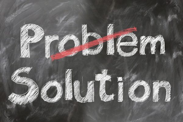
People go on the internet for two reasons and those are to move away from a problem or move towards a solution.
Focus your free information on why they don’t have what it is they want and how they can get it.
But don’t give everything away.
Just get them started on their way.
Give very good, clear and precise advice they can use to begin to reach their goal or solve their problem.
Some people call this ‘useful but incomplete,’ while others call it ‘results in advance.’

Let’s look at each part of your landing page so you can make it better.
Does the headline fascinate your visitor?
When I had my own mail order business I would always run intriguing headlines.
This one got a 34% response…
“Read This or Die Young!”
Now if you’re over 40, you’ll want to read on.
Another headline that I ran in a national magazine for 18 months was…
“Oxygen Deficiency… do you suffer from these symptoms…?”
Notice how I always put speech marks around a headline.
This makes it feel like it’s being said or quoted by someone.
Your headline must call out to your intended reader.
If you call out to everyone you call out no one.
Most people online try to please the entire range of prospects for their business.
And that can never work.
They see themselves as all things to all people. That is, they appeal to a broad audience because they can do so many things for them.
However, when someone goes online they are looking to solve a particular problem.
That means while you’re being a generalist they are looking for a specialist.
So, if they find you but you’re not speaking directly to them, they’ll go in search of someone who is.
And there’s plenty of choice as you know.
Every headline I’ve ever written sounded more like an editorial than an advert.
As I said earlier your website must not look like an advert.
In fact, anything but advertising is the rule.
You want an editorial feel to your website because people are going online for information.
And in magazines editorial articles are read far more than adverts.
Someone once said the purpose of the headline is to get the reader to read the next sentence.
And the purpose of the next sentence? Why, to get the reader to read the following sentence of course.
Each sentence should ‘hold hands’ with the next sentence until the reader can’t help but read the whole page.
Now that’s what all good sales copy must do.
Onwards…
When you write do you use ‘corporate-speak?’ You know stilted business language like we are the purveyors of the finest quality blah, blah blah.
Instead of saying we have the best _____ available anywhere.
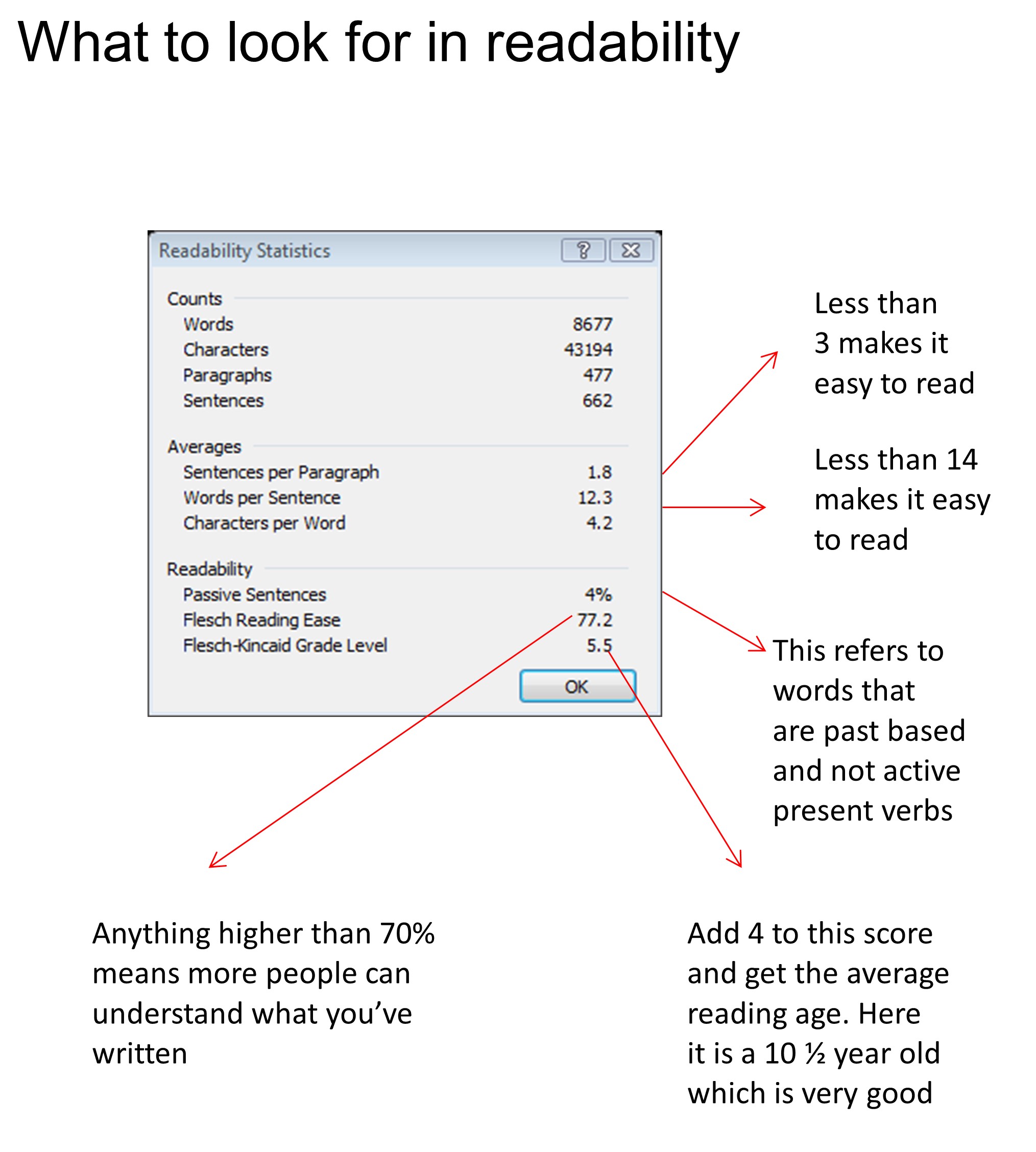
Microsoft word has an amazing anti-corporate speak tool built in.
It was called readability statistics… now it’s Editor
You’ll need to turn this on.
The technical aspects of this are way outside of what we have time for here.
Find a computer expert and get them to do this for you if you can’t do it yourself.
Once it’s set up press f7, and Microsoft Word checks for spelling mistakes and grammatical errors.
When that’s complete it shows you the readability statistics.
These show how easy (or hard) it is to read what you’ve written.
Let me go walk you through this.
You’ll pay close attention to the words per sentence. There should be no more than 14.
And lines per paragraph, again there should be no more than three.
Next take a look at where it shows passive versus active sentences. If it’s more than 5 per cent, you’ve been talking too passively and probably about the past.
I’ll tell you what to do about these in just a second.
Next you’ll see a number that shows a score out of 100.
This tells you how many people out of 100 can understand or how clear your message is.
If this is below 70 per cent it’s back to the drawing board.
By the way, don’t worry if this happens to you when you run this check, it happens to all the people I help.
The last one shows the reading age. Take whatever number it says and add four to get the actual reading age.
If it’s over 12 panic, because most of your readers will find your writing too difficult to read and as a consequence they won’t read it.
Okay, you want to know how to correct all these.
It’s easy but not simple.
This is how I did it.
Highlight each sentence, then press f7 and when you’re asked if you want to check just this section click yes.
Then you will get the readability stats for just this sentence.
You rewrite until the passive sentence is 0 per cent, the next score is above 70 per cent and the reading age is 11 or lower.
This one skill will pay you back 100 times your time investment in the time it’s taken you to read this far.
Most people can’t write this way and when you do, you’ll have the edge over almost everyone.
By the way… the headline I mentioned earlier,
“Read This or Die Young,”
has a 100% readability score.
You can’t get better than that.
Why did I tell you this?
To illustrate a point.
If 100% of the people reading my headline can understand it, then they will most likely read on.
Of course you don’t have to aim for 100%, anything above 70% over the entire article is fine.
It doesn’t matter much if one of two sentences are a little on the corporate speak side as long as what went before and what goes after are easy on the eye.
It’s worth repeating here the average reading age in this country and in America is that of a child of ten year old.
Yes, it’s hard to believe but true.
When you write so a child of ten can understand you then what you write is more likely to be absorbed.
Okay time for the next important element for a successful web site.
Does the web design layout and graphics support the web copy?
If you listen to any web designer they will tell you the opposite.
They want the layout and the graphics to do all the talking.
They’ll even say things like, “a picture is worth a thousand words,” and other nonsense.
Pictures only work if they support the message on the web page.
Don’t believe me?
Okay go out and buy a newspaper and see how many random pictures are in the news articles.
If you find any, I’d love to see them because I haven’t.
What are the best pictures to have online?
Studies have shown that people love to look at pictures of other people. So, start with a photo of you.
Then put an interesting caption under the photo.
Attraction Creates Curiosity.
Why?
Because that’s what gets noticed and read the most.
Here are some more tips on layout and design.
Landing page Layout.
I hope this is all coming together for you.
Keep in mind what I said earlier about direct response.
The words ‘direct response’ mean producing action from a single exposure. In other words, landing pages equal action.
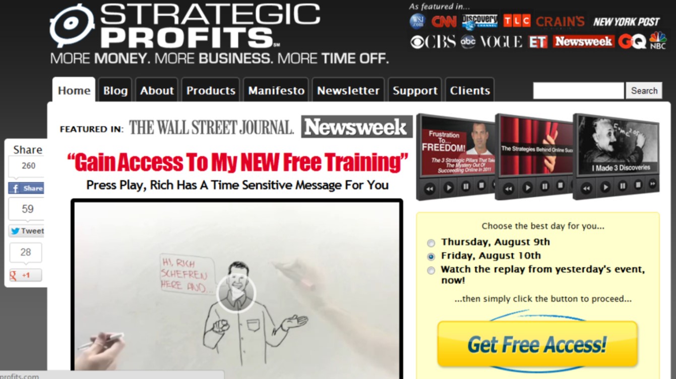
Here is a great example of a successful landing page layout.
looks like an “ordinary” webpage until you scroll down here:
Notice the subtle call to action with the words “Free Member Newsletter & Discounts.”
These guys really know their stuff.
This online business makes $20 million a year!
As you can see from this example, you want your landing page to have an opt-in form.
Do you have something like this?
Your landing page is not a like the reference section in a library, unless of course you’re a government agency or department.
Some people call these opt-in pages, there’s usually a form where you’re invited to enter your email address in return for an “information widget.”
Or as some people call it – a free report.
Another commonly used term is “squeeze page”. It’s called that because you’re trying to squeeze an email address out of your reader.
If you don’t use opt-in forms, how can you talk to your prospects?
You must aim for a single focused action you want your prospect to take.
With a web page you can choose from a number of different roads for your prospects to go down.
Each one looks inviting, and you let your visitor choose which one they like.
On a landing page there’s only one road.
This is known as “one decision marketing.”
Search engines don’t like landing pages that only have one action and nothing else.
These are like a cul-de-sac.
As you saw earlier landing pages today are more sophisticated.
They look like a conventional website but still ask for action.
Most marketing is mediocre.
That’s because most people have no idea how to construct a landing page that compels prospects to give their email address
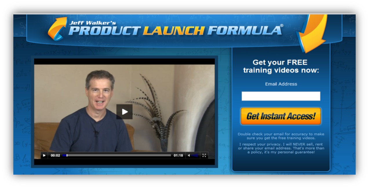
Here’s a great example of another kind of landing page. On this one there’s a video instead of copy.
As you can see, there are strong branding elements on this page. Because the product name is so strong it doesn’t need a tag line.
You can clearly see how this landing page is relevant and specific to his prospects.
Let’s quickly bring in some of the latest research on psychology.
There are four core drives we all have.
Three of these drives are positive and one is negative.
THE DEFEND DRIVE
You start with lowering your prospects defences, so they don’t reject you. Once you get past your prospects defences then you begin to bond with them by revealing interesting facts about yourself.
THE BOND DRIVE
When you’re in the bonding phase of your sales message you’ll be telling your story.
Here you’ll want to connect with your prospects.
However, when you connect in a structured way, it compels your prospects to engage with you.
THE LEARN DRIVE
There’s a huge trend online right now for ‘how to’ eBooks.
What does that tell you?
It shows that people love to learn.
For over 30 years there have been books and courses sold on memory training, speed reading and mind maps.
I should know, I’ve bought most of them!
These are all powerful indicators of the drive to learn.
The multi-trillion-dollar personal development industry thrives on this core motivation.
Learning is something we automatically do.
And today more people than ever want to learn so they can improve their life.
The opposite of learning is ignorance, and no one likes to think of themselves as ignorant.
That’s why the drive to learn comes into play.
The ‘learn’ drive fits neatly into the other three.
We learn to defend ourselves against those who would do us harm.
We learn to bond with people who can help us or are good for us.
And if we’re really smart, we learn to make these relationships better as time goes on.
Especially our romantic relationships.
THE ACQUIRE DRIVE
You want your prospect to take some sort of action. Here’s where you close the sale. You want them to accept your offer.
Before you move into the actual ‘asking for the order’ part you MUST strengthen their desire with an irresistible offer to opt-in.
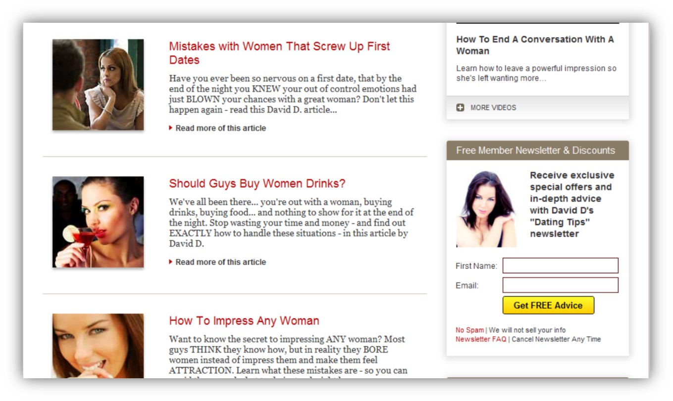
This page and the “Double Your Dating” landing page both do the following:
- They disarm your defence mechanism with their logo or header
- Their tag line allows them to begin the bonding process with you
In the “Product Launch Formula” video, Jeff Walker bonds with you first with a short “sound byte” of information about himself.
Next, he takes you into the learning phase.
Only then does he take you to the acquire phase.
And this completes the cycle.
In this last part of the formula, you pile on the benefits they’ll be receiving as soon as they opt in.
You tell your prospect what’s it going to cost her take the action you want her to take.
A word of caution about your free give-away…
Have you built up the value of what you’re giving away?
It can be as hard to sell something for free as it is to sell something people have to pay for.
This is where you demonstrate value, or you won’t get your prospect wanting to acquire what you have.
If you get this wrong your prospect will return to defence mode and click away from your site.
You need to be subtle when you’re giving something away free.
Only mention the word “free” once or twice.
Spatter it everywhere and you trigger your visitor’s defence mechanism.
As a quick side note, the defence mechanism is really nothing more that the “fight or flight” response.
And since people can’t fight you online because you’re not physically present, they’ll choose the second option and “get the hell outta there.”
The actual layout of your landing page can vary.
A good rule of thumb is logo on the top left and tagline beneath it.
Here’s a great example.
Okay… You may not be able to emulate this if you’re just beginning to understand landing pages, so a simpler version would just have a compelling headline that combines curiosity with a single benefit.
It’s a great idea to bold the text that talks about the benefits on offer.
This is done for the scanners online.
Usually, people visiting your website will only want to give a few seconds of their time to see if what you have is useful for them.
When you transition from your headline to the next line, make sure you expand on your headline.
There must be a direct connection between the two.
Next you have five or six mini benefit statements.
These are called bullet points.
Then you tease the reader to want to know more so they “have” to enter their email address.
You can do all of this in a video if you like.
Better still, have a video plus text underneath.
Some people love to watch videos, while others love to read.
By including both you’ll get much higher opt-in rates.
Design tip:
Never use more than one column. Designs that look complicated turn people off.
Simplicity wins every time.
Unless you’re from the Inland Revenue Service.
Did I just say service?
Hmm… Anyway.
One important distinction is, always be subtle.
Too many web designers want to shout at prospects.
Here are the techniques they use:
Bolding text.
Exclamation points everywhere!!!!!!
Red or other strong colours.
Larger than life font sizes.
All of these scream “hype” to your prospects.
Understatement is far more persuasive than overstatement.
There’s a fun sign I once saw in a cartoon.
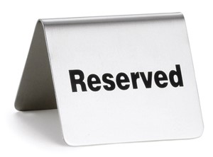
It showed the inside of a restaurant with a folded over card on the table with the word “Reserved” on it.
The next table had a similar card but this time the word was
“Extroverted.”
Too many people think that being extroverted is the way to put their message across.
If you study the master copywriters and sales letters that have made millions of dollars, you’ll find they are all low key.
Look up Martin Conroy’s famous “Wall Street Journal” letter. He racked up sales of over two billion dollars by using understatement.
If it’s good enough for him, it’s good enough for us.
Design tip. Make sure your “call to action” button is easily visible.
Make it look like a button so that it is inviting to click on.
The colour of your button is very important.
Orange has been called the most positive colour on the planet.
If you look at religious teachers and swamis, they all wear orange.
You can also use claret.
This is a great choice as it’s a warm colour.
The words on your button should convey a benefit and not just say “click here” or “get instant access.”
If you’re promoting time management, you could use words like “start saving an hour a day”’
Have a picture of your free gift above your button.
If its free report have an image of the front cover.
Design tip. Use two to three colours maximum. Be careful about contrasting colours as they strain your visitor’s eyes.
No blue type on green background.
Make it readable. The best is black type on a white background.
The latest trends are showing that animation is making a come-back on landing pages.
Although video is great, an animation can grab and keep attention fast.
Another strategy used with landing pages is the pop-up light box.
This originated with one of my clients Michael Dunlop and has been used by many of today’s brightest online marketers.
It’s called a light box because it dims the page you were looking at and now dominates your screen with an offer to opt-in.
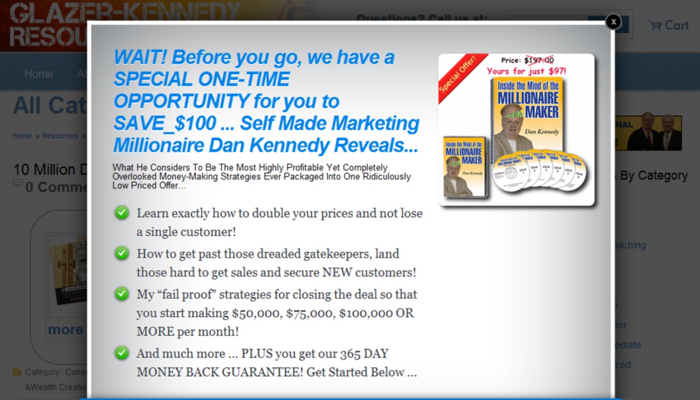
I’ll end this report with an example of one of the four top thought leaders online today and show you how his light box dominates the webpage.
Use this idea if it appeals to you.
If this seems like a lot of hard work, it’s because it is.
That’s why savvy entrepreneurs outsource this kind of work.
Now here’s something you’ll find amazing…
It comes down to two common words put in an uncommon way.
The key to online success is no mystery.
It’s simply this:
Nothing happens online, until the copy is written.
It doesn’t matter if you’re using Facebook, Twitter, Linkedin, YouTube, WordPress or any other Web tool you can think of.
Take all the words away, and what do you have?
Everything in life comes from words.
And persuasion is THE most highly regarded skill in our society.
Imagine if you removed every word from your website and then replaced them with words written by a world-class sales copywriter.
Now you’d have a completely different website.
And your conversion rates would literally astound you.
If you aren’t getting high conversion rates and you’re not a world-class copywriter, then hire one.
Or better still – hire a mentor you can trust
Want an unfair advantage over 98% of ordinary copywriters?
Forget the basic copy formulas that no longer work. BAB (Before and After Bridge) PAS (Problem Agitate Solve) AIDA (Attention – Interest – Desire – Action) buyers are immune to these.
BUT the 13 ways to intensify desire, the One Belief 10 Questions or the 12 Proof Elements – all sales copy must have are these proven million dollar winners.
They are all here (and more) inside this book.